-

-
Date July 10, 2026
10 Logo Design Mistakes That Damage Brand Credibility
A brand’s logo goes beyond graphical representation; it’s the first impression the audience forms and the starting point for the credibility-building process. If a brand fails on its credibility front, growth will also stall.
This makes Leading branding design services relevant and significant for business, because they help brands avoid costly mistakes and build logos that promise timeless appeal.
Table of Contents
Brand Logo: The Credibility Carrier
Treat your logo as a shorthand for your brand’s promise. As Harvard Business Review also reiterates, “Design is not just about how it looks, but how it works – and how it makes people feel about your brand.”
When logos fail, trust also falters, conversions decline, and competitors gain both time and ground. For Irish businesses, investing in company branding services or branding solutions in Ireland allows logos to align with the market’s expectations and positioning.
The 10 Mistakes That Damage Brand Credibility
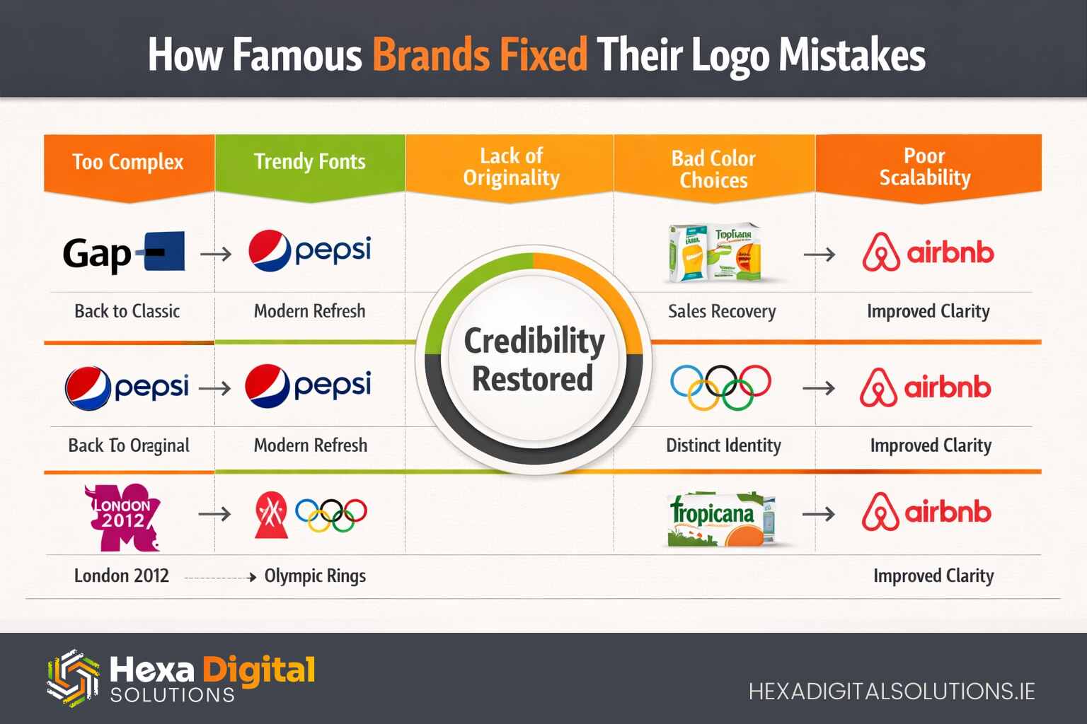
The discussion in this section proves that even big brands can lose their credibility when they succumb to some of these logo design mistakes, which result in the weakening of recognition, trust, and long-term brand consistency:
1. Complex and Busy Logo Design
Overloading of logos directly impacts brand recognition, particularly on smaller screens. Remember, Gap’s 2010 logo revamp attempt received fierce criticism for changing its familiar identity.
However, it launched a complex gradient box with a minute ‘p’ – which made its visibility on its products and across different media unclear. This forced the company to restore its original classic blue box look within a week.
2. Blindly Following Trends While Selecting Typography
Fonts picked just because they are in the top trends prove to be short-lived. Such trend-driven logo designs fade fast and appear outdated.
Pepsi’s 2008 redesign of its logo included a tilted “smile” orb with complex gradients that looked trendy, but it could not achieve timeless appeal. In 2014, the brand had to simplify and flatten its design for a cleaner, more enduring identity.
3. Poor Adaptability
A logo should remain adaptable when exhibited on a billboard or a mobile app icon. Take, for instance, Airbnb’s 2014 Bélo symbol. It initially looked extensively detailed and random at smaller sizes, denying instant recognition across different digital platforms.
The brand later had to refine its design by simplifying it for different apps and social profiles.
4. Lacking Genuineness
Generic or copycat logo designs are always easy to forget and invite negative attention. They look like cheap copies of their competitors and eventually result in a decline. A relevant example to explain this is the London 2012 Olympics Logo.
The jagged “2012” was criticized for resembling Lisa Simpson doing yoga. It also looked inspired by other event logos. This controversy prompted fans to question the professionalism of the brand’s creative departments.
5. Not Taking Color Choices Seriously
Colors play a significant role in drawing attention and building long-term recognition. Tropicana’s 2009 design update replaced its iconic orange-with-straw visuals and familiar color cues with a generic glass of OJ with washed-out text, making it difficult for buyers to recognize products on shelves.
After sales reportedly dropped by 20 percent, the brand had to revert to its original imagery and color palette.
6. Inconsistency In Brand Messaging
A logo should reflect the brand’s promises and personality – otherwise, it would give the brand a very fake look. Uber’s 2016 “bit and atom” logo aimed at projecting a technically advanced persona.
But drivers and riders failed to relate and found it cold and confusing. It didn’t align with Uber’s human-service vibe. They changed it in 2018 to a simpler “U”.
7. Creating Clutter With Multiple Font Types
Using multiple typefaces in a logo creates visual confusion and undermines professionalism.
During Yahoo’s 2013 redesign process, several leaked logo ideas revealed that initially, they mixed contrasting fonts and fancy styles, getting criticism for looking inconsistent and resembling a ’90s flyer look. Yahoo finally selected a cleaner, single-typeface logo that restored its brand credibility.
8. Not Caring About Cultural Context
Symbols and colors can carry different meanings across diverse markets. During KFC’s initial expansion into China, its branding and messaging failed to achieve strong cultural integration, leading to a disconnect with the local market.
The brand later had to localize its visual identity and communications to better reflect regional preferences and gain customer trust.
9. Meaningless Symbolism
Logos lacking a meaningful visual concept are easy to forget. Mastercard, during its 2016 logo revamping, removed the word ’ Mastercard ’ from the overlapping circles for digital use.
Initially, customers took it as just 2 circles. Mastercard had to spend heavily on brand education to link the symbol back to trust and payments.
10. Not Paying Attention To Multi-Platform Flexibility
Contemporary logos in the current digital era are expected to work seamlessly across websites, merchandise, packaging, and social media platforms. Starbucks removed the ‘Starbucks Coffee’ text in 2011 to launch a globally adaptable identity.
But the details in the mermaid were too complicated to be printed on small cups and stamps. They later had to redesign the mermaid to have fewer lines so it would stay consistent and compatible across every touchpoint.
By avoiding these mistakes, brands can create logos that build trust, drive recognition, and ultimately boost conversions and growth.
Logo Mistakes Leading To Strategic Losses
Forbes also confirms, “Your logo is often the first impression. A bad one tells customers you don’t care about details.” These mistakes can cost businesses credibility, recognition, and revenue. That’s why corporate branding services and a trustworthy corporate branding company are significant for sustainable growth.
How to Avoid These Mistakes
Creating a successful logo design depends on strategic planning, not guesswork or short-lived design trends and choices. The best approach is to identify ways to avoid these mistakes.
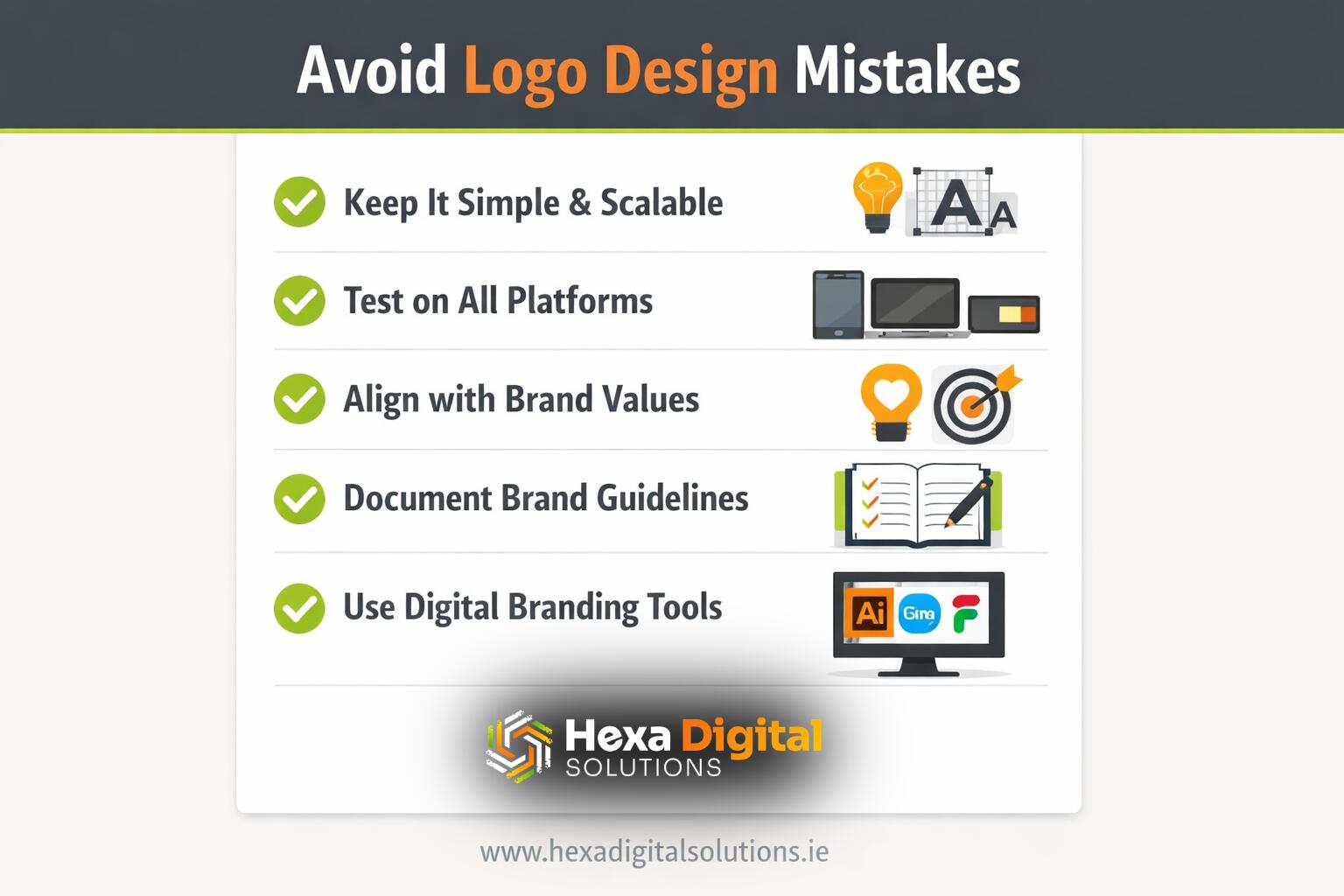
Follow these best practices and help your businesses create logos that stay in memory, enjoy credibility, and earn enduring goodwill.
Future-Proofing Logos in 2026
With AI-focused design tools, the risk of generating generic logos has increased. Now, it is the businesses’ responsibility to ensure authenticity and adaptability. Investing in top brand identity design options in 2026 allows logos to evolve with digital ecosystems.
Hexa Digital Solutions Perspective
Based in Dublin, Hexa Digital Solutions provides creativity blended with measurable execution.
From Brand Identity vs. Brand Image: What Irish Businesses Need to Know to How to Build a Memorable Brand Identity From Scratch, Hexa guides businesses in avoiding pitfalls and creating logos that adapt across all platforms.
Their integrated service mix – from branding to e-commerce and book publishing–reemphasizes that logos aren’t solo images but credibility engines driving visibility, trust, and conversion.
Conclusion
Brands are advised not to use their logos as decoration; consider them part of their credibility-building ecosystems. Avoid these common mistakes and, in return, experience brand loyalty, conversions, and revenue generation.
Businesses investing in leading branding design services secure their goodwill and future. Partnering with Hexa ensures your logo fits every touchpoint – from websites to bookshelves – and leads to measurable impact.